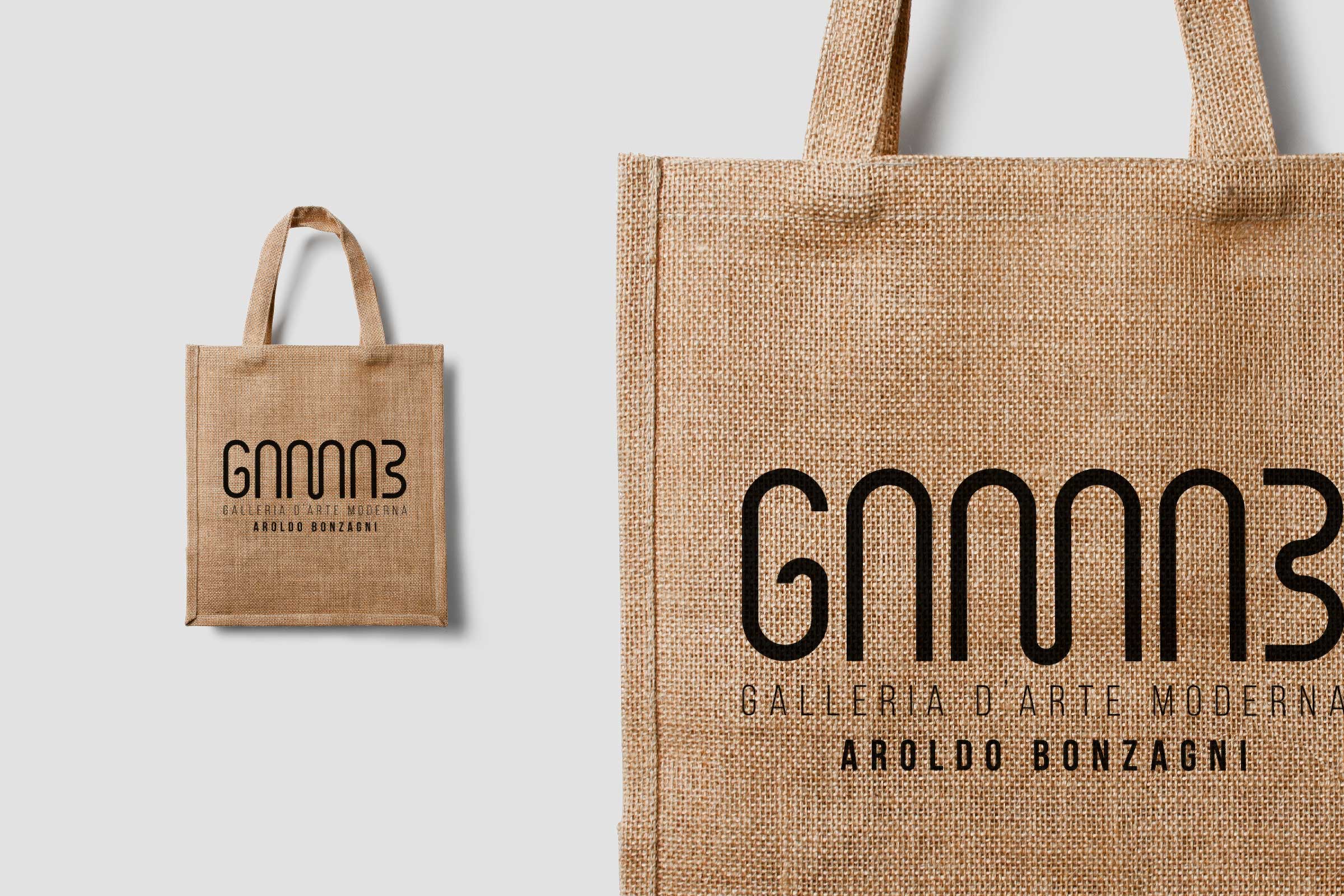
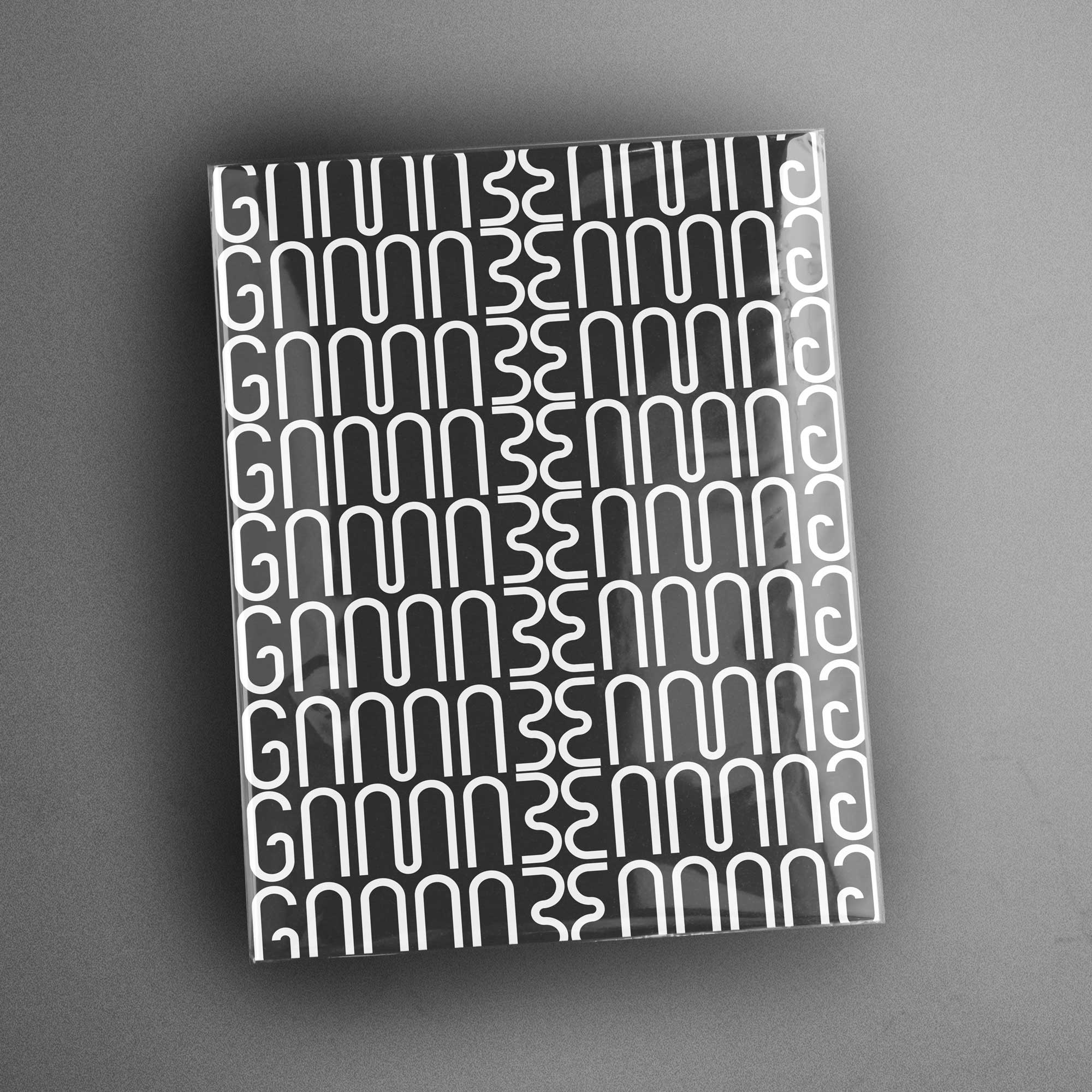
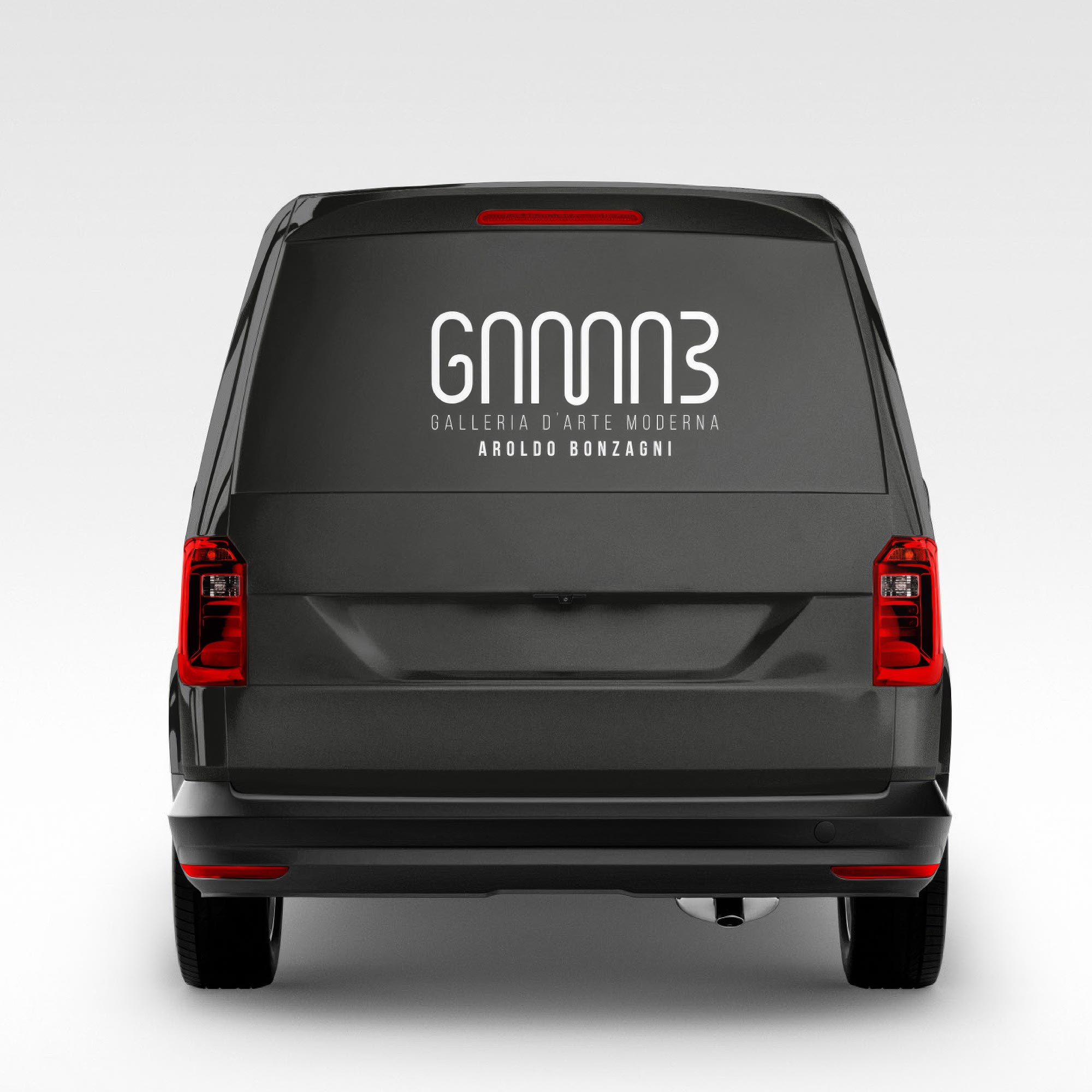
The logo must be the basic element to express the visual identity of the Gallery. This is divided into a representative sign and lettering. At the base of the visual identity, a structure of modules was used to form the logo, the shape of which recalls in a minimal way the arches of the Gallery. The choice of black is due to keep the visual impact of the Gallery’s visual identity clean and elegant. The linear font BEBAS NEUE is due to echo the concept and shape of the logo.


Examples of brand applications, from print media to possible billboards.